There’s an old story about a giant ship that broke down in port. The owners brought in an old engineer. He listened to the engine, felt along the hull, then tightened a single bolt. The ship roared to life. His invoice: $20,000. “Twenty thousand for five minutes?” they protested. He itemised: “Tightening the bolt: $1. Knowing which bolt to tighten: $19,999.”
That’s the difference expertise makes—especially when the stakes are people’s lives.
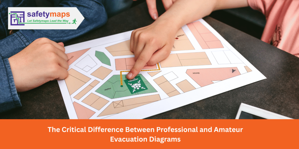
Imagine the fire alarm blares. Smoke begins to haze the hallway. In a moment of rising panic, you and your colleague’s glance at the wall for the evacuation diagram. In this critical instant, you need absolute clarity. You need a map that is instantly understandable, accurate, and trustworthy.
But is it?
To the untrained eye, most evacuation diagrams look the same: a floor plan with some lines and symbols. This apparent simplicity is deceptive. There is a vast and vital difference between a diagram created by a dedicated emergency planning professional and one drafted by a “sideliner”—a graphic designer, a technician, or an administrator or staff member with some software. One is a life-saving tool engineered for crisis; the other is often just a picture with a purpose it can’t fulfill.
Understanding this difference isn’t just about compliance; it’s about protecting lives.
The Foundation: Deep Regulatory Knowledge
A professional’s first priority is compliance with the governing standards, such as AS3745 (current version), Planning for emergencies in facilities. These are enforceable standards that dictate everything from the minimum size of text to the specific orientation of the diagram.
- A Professional: Lives and breathes these standards. They know the required elements, the correct symbology, and the legal ramifications of non-compliance. Their work is designed to pass audits and, more importantly, to function correctly within a legally sound emergency plan.
- A Sideliner: Often has a superficial understanding at best. They might download a list of symbols from the internet or copy a style they’ve seen elsewhere, unaware of the subtle but crucial requirements. This can lead to a diagram that looks legitimate but is fundamentally non-compliant, exposing the business to significant legal liability.
The Anatomy of a Compliant Diagram: What You Don’t Know Can Hurt You
Take a look at one of your current diagrams. It has a floor plan, a “You Are Here” marker, and some arrows pointing to an exit. That seems to cover it, right? But what if compliance is far more detailed than that?
Consider this: Is the title “EVACUATION DIAGRAM” simply a good idea, or is it a mandatory component? Does the diagram need to show the path to the assembly area, or just the location of the assembly area itself? What about the specific symbols used for a fire extinguisher versus a fire blanket—are they interchangeable, or is there a required, standardized legend?
A sideliner might guess the answers to these questions. A professional knows them cold. They understand that each of these details is a specific requirement within the Australian Standard, and getting even one of them wrong can render the diagram non-compliant. This is the expert knowledge you are paying for—not just the ability to draw lines on a map, but the certainty that the map is legally sound and functionally effective in a crisis.
A Piece of a Larger Puzzle: The Emergency Plan

Crucially, an evacuation diagram does not exist in a vacuum. It is a visual component of a much larger, legally mandated Emergency Plan. This comprehensive plan is the backbone of your facility’s safety strategy, outlining everything from warden responsibilities and communication protocols to specific procedures for different types of emergencies.
The evacuation diagram must perfectly align with this plan. The assembly area marked on the diagram must be the same one detailed in the written procedures. The equipment shown must match the facility’s inventory and inspection records. The routes must support the evacuation strategy defined for the emergency control organisation (ECO).
This is where a professional’s value becomes undeniable. They don’t just create a graphic; they ensure its seamless integration into your entire safety framework. It all forms part of a full system that professionals know how to tie together, ensuring there are no dangerous contradictions between what people see on the wall and what they have been trained to do.
The Science of Simplicity: Designing for Duress
When people are under stress, their ability to process complex information plummets. A professional evacuation diagram is designed with this human factor in mind.
- A Professional: Uses specific design principles to ensure instant readability. This includes using mandatory pictograms, ensuring high color contrast, selecting clear and simple fonts, and decluttering the floor plan to show only essential information. The goal is for a person in a state of panic to glance at the diagram and know where they are and where to go in under three seconds.
- A Sideliner: Tends to focus on aesthetics over function. They might use company branding colours that have poor contrast, add unnecessary architectural details that create confusion, or use icons that are visually appealing but non-standard. Their diagram might look clean and pretty in a boardroom presentation but becomes a confusing mess during a real emergency.
The Bottom Line: An Investment in People
Choosing a sideliner to create your evacuation diagrams might save a small amount of money upfront, but the potential cost is immense. An inaccurate or non-compliant diagram isn’t just a compliance failure; it’s a direct risk to every person who relies on it. It’s a weak link in a safety system that can’t afford to have one.
A professional evacuation diagram is more than a map. It’s a piece of safety engineering, a clear voice in a moment of chaos, and a critical investment in the well-being of your team.
What value do you put on your people’s lives?